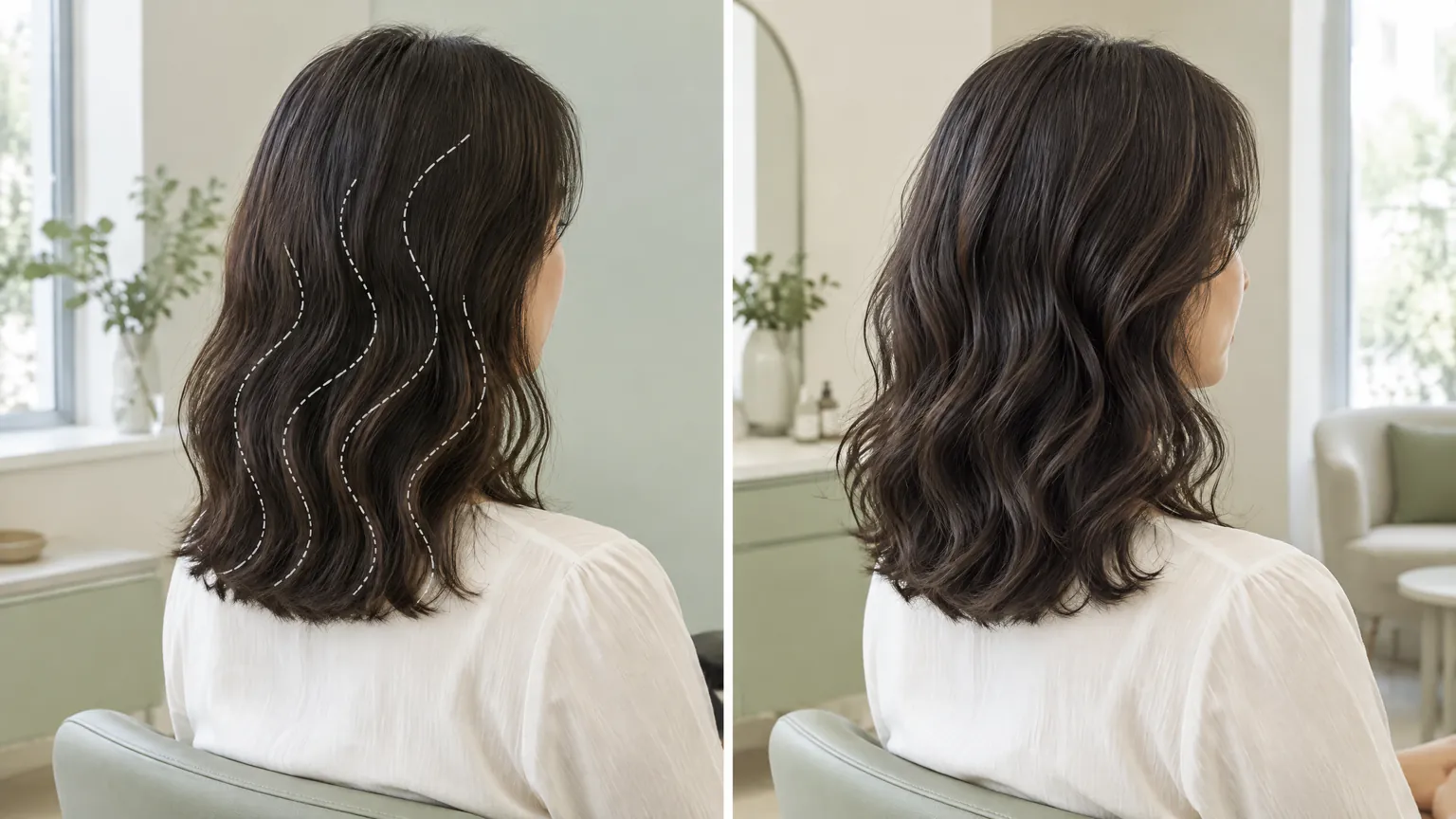
Warm, cool and grey coverage: use a consultation board thoughtfully
This column offers salon and styling information and links to Vit So, a hair website under the same ownership. Hair services are provided by Vit So, not GotGear.
The short answer
Use a consultation board to compare a few shades at similar depths, then discuss where your greys appear and how much contrast you want as roots grow. Check physical swatches under consistent, neutral-looking light and a second everyday lighting condition. Treat shade names and photographs as starting points, not promises. Your previous colouring, current hair condition and preferred upkeep should shape the decision more than a rule that assigns warm or cool hair to a particular skin tone.
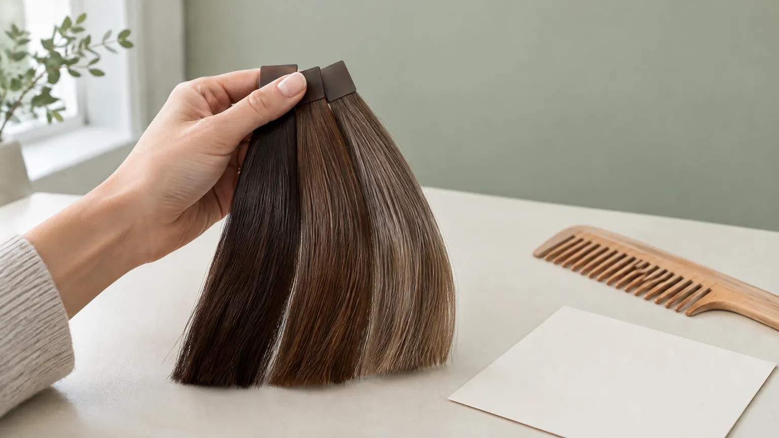
A useful colour consultation board does more than display attractive brown shades. It helps separate three decisions that are easily confused: how light or dark the hair should look, which colour direction you prefer, and how visible you want grey strands to remain. Choosing a cool brown does not automatically answer the coverage question. Choosing complete coverage does not decide whether the finished brown should look golden, reddish or muted.
For readers comparing options, and small salons organising consultations, the board should make those distinctions visible. A few relevant swatches, a simple map of the hair and clear notes are more useful than a wall of unnamed inspiration photographs. The aim is an agreed direction that can be assessed against the actual hair, rather than a promise to reproduce an image exactly.
Compare depth before deciding on warmth
Start by choosing a broad depth: dark brown, medium brown or a lighter brown direction. Then compare warmer and cooler examples within that range. If one sample is substantially lighter than another, it becomes difficult to tell whether you prefer its tone or simply its brightness. Ask the stylist to explain the samples using the terminology of the colour range being considered; a shade number without its range is not a complete description.
Warm and cool are relative descriptions, not universal beauty rankings. A warm brown reference might show golden, coppery or reddish qualities, while a cool reference might look more muted or ashy. Those labels still need a physical comparison. Different photographs described as the same shade can communicate quite different expectations.
Give each reference a specific job
Choose one reference for depth and another, if necessary, for tone. Say what you like in each: the brown visible through the lengths, the subdued warmth near the face, or the contrast between roots and ends. Also identify something you do not want. This is clearer than presenting several incompatible photographs and asking for all of them at once.
For a starting vocabulary, Vit So's guide to chocolate brown hair offers related reading to bring into that discussion. Use it to frame questions, not as evidence that a particular result is suitable for your hair. GotGear and Vit So share ownership; these links are contextual resources, not independent salon endorsements.
Use consistent light, then check another setting
Put the samples together under one consistent light before moving between locations. Avoid comparing one swatch beside a window with another under a decorative lamp. A neutral-looking background and a position away from strongly coloured reflections make the comparison easier to organise. They do not turn an ordinary salon corner into a calibrated colour laboratory.
Lighting matters because colour perception depends on both the light source and the way an object reflects it. Colour-measurement specialist X-Rite explains metamerism: two colours can appear to match in one lighting condition but cease to match when the light changes. Its guidance concerns colour evaluation generally, rather than a prediction of an individual hair-colour result. The practical lesson is to avoid treating a single-light match as conclusive.1
Separate a physical sample from a screen image
A phone photograph is useful for describing an intention, but it adds another variable. Ask whether the reference is heavily edited, and do not change the display settings halfway through a comparison. Use the same screen for the initial discussion, then return to physical samples and the actual hair. Neither a screenshot nor a sample should be presented as a guaranteed preview.
After narrowing the choice, look at the shortlisted swatches in a second relevant setting, such as daylight and the indoor light where you spend much of your day. Note whether the preferred brown still appeals to you. This is a preference check, not a demand that hair look identical everywhere.
Read the board as a comparison, not a recipe
The following comparisons help keep a consultation focused. They describe questions to resolve, not formulas or guaranteed outcomes.
| Decision | What to compare on the board | What to ask before choosing |
|---|---|---|
| Depth | Brown samples that differ mainly in darkness | Which direction is realistic from my current roots and lengths? |
| Warmth | Warmer and cooler samples at similar depths | Am I rejecting warmth itself, or only the bright copper in this reference? |
| Grey visibility | References showing an even-looking colour versus visible tonal variation | Do I want greys concealed, softened or deliberately visible? |
| Root contrast | The desired brown beside a representation of the natural root area | How will a visible root line fit my preferred upkeep? |
| Existing lengths | The current ends beside the intended direction | Will previously coloured sections need a separate assessment? |
| Everyday appearance | The same shortlist under two relevant lighting conditions | Do I still like the direction when the light changes? |
If cooler brown is the shortlist, use the guide to ash brown hair colour as a prompt to distinguish ash from beige and to describe how muted you want the result to appear. The useful consultation question is not whether ash is fashionable, but what changes would be needed from your current hair and which compromises you would accept.
There is no need to assign every complexion a fixed warm or cool category. Hold the selected references near the face, check them in the agreed light and describe your response. You might prefer a warmer brown with your usual clothes, or dislike a very muted shade despite enjoying it in a photograph. A personal preference can stand on its own without a claim that one shade flatters everyone with the same skin tone.
Map greys where they actually show
An overall estimate of grey hair can hide the detail that matters most to you. Greys concentrated at the front hairline may be more noticeable in your usual styling than scattered strands underneath. Ask the consultation to consider the parting, temples, front hairline, crown and less visible areas separately. These are observation points, not a home diagnosis or a demand to calculate an exact percentage.
Check the hair both in its normal parting and in any style you wear regularly. If you tie it back for work, include the exposed hairline. If you alternate partings, say so. The board can carry a small outline of the head with notes such as 'most noticeable here' and 'happy to leave some variation here'.
Define what coverage means to you
Some people want the grey strands to be as unobtrusive as possible. Others want softer contrast while retaining variation, or want to keep greys visible within a coordinated overall colour. Do not assume that the word 'natural' communicates which of these you mean. Show a reference and explain the tolerance you have for visible lighter strands.
Vit So's grey coverage service page is a place to check the relevant service description before asking about your own coverage goal. Confirm the proposed scope directly; a service label does not establish that every shade, technique or level of concealment will be appropriate for every head of hair.
Root contrast deserves its own note. A preference for an even, darker appearance today can coexist with a dislike of a distinct lighter root line later. Ask the stylist to explain that trade-off rather than selecting the darkest swatch merely because it appears to hide the sample greys most completely.
Put previous treatments beside the preferred shade
A consultation board should record the starting point as carefully as the target. Tell the stylist about previous permanent colour, lightening, straightening, perms and home colouring, including uncertainty about products or dates. Roots and lengths may have different histories. An attractive sample does not show what those sections have already undergone.
The American Academy of Dermatology cautions that cosmetic treatments can leave hair dry and brittle. Its colouring guidance recommends staying close to the natural shade and explains that substantial lightening involves greater peroxide exposure and more damage. This supports a cautious discussion of how much change to pursue; it does not prove that any darker colour service is harmless.2
If the ends already feel brittle or break easily, make that an explicit part of the discussion before agreeing to further processing. Ask whether the target needs to be modified, whether different sections require different handling, or whether the colour plan should be postponed. Do not treat a conditioning step as proof that previous damage has been permanently reversed.
Separate colour testing from allergy precautions. A strand assessment, if proposed, may help the stylist evaluate a cosmetic process on a small section; it is not a substitute for the product's skin-test instructions. The FDA advises following the label and performing the instructed skin test before each use. It also warns that reactions can occur despite past trouble-free colouring, and that a clear skin test does not guarantee no reaction during colouring.3
Mention previous dye reactions before booking chemical work. Do not colour an irritated or damaged scalp. Persistent irritation, pain or sudden marked hair loss should be assessed by a qualified healthcare professional, rather than addressed by selecting a supposedly gentler shade. The FDA advises seeking healthcare advice after a reaction to hair dye.3
A hypothetical consultation with competing priorities
Consider a hypothetical reader, Alex, who wears their hair tied back at a reception desk, has noticeable greys around the temples and previously coloured lengths that now look warmer than the roots. Alex likes a cool brown photograph but does not want frequent appointments or a major lightening change. This is an illustrative situation, not a reported client result.
The board first places a medium warm brown beside a medium muted brown. Alex identifies the muted quality as the preference, rather than asking to copy the photograph's much lighter ends. Next, the hair map records the temples as the main concern and the underneath greys as acceptable. This makes the desired coverage more specific without assuming a formula.
The stylist would still need to assess the roots, old colour and condition of the lengths. Alex can ask what is feasible without additional lightening, and whether the plan would conceal the temple greys or leave some tonal variation. If the proposed approach conflicts with the preferred upkeep, the board gives a reason to reconsider the target before proceeding.
The useful end point is a clear agreement: preferred depth, acceptable warmth, areas of greatest concern and any limitations identified during assessment. It is not an invented after-photo or a promise that one appointment will deliver an exact match.
Make a small salon board easy to use
For a compact salon, organise the board around decisions rather than dramatic photographs. Keep a limited set of comparable swatches at hand, with a neutral backing and space for consultation notes. Store the samples consistently and replace visibly altered or worn examples so staff are not discussing different-looking references under the same label.
Record the sample identifier and colour range as well as the agreed description. 'Muted medium brown, not strongly coppery' is more useful alongside an identifier than 'the nice brown'. Keep the root and grey-visibility notes separate from the tone preference. A person may keep the same preferred brown while changing how much grey they want visible.
Agree on a usual viewing position that does not obstruct movement through the shop. A dedicated discussion spot can also keep the board away from mixed decorative lighting. There is no requirement here to purchase a specialist light booth; the immediate improvement is consistency and an honest explanation of what the samples can show.
Before proceeding, use this short consultation checklist:
- Choose a depth range, then compare warm and cool options within it.
- Identify the feature wanted in each reference and one feature to avoid.
- Check the shortlist in consistent light and one relevant alternative.
- Mark the grey areas visible in the usual parting and tied-back style.
- State whether greys should be concealed, softened or retained.
- Disclose previous chemical work, current breakage and any dye reactions.
- Ask which parts of the plan remain uncertain after assessment.
- Confirm the agreed service scope, preparation instructions and upkeep expectations before proceeding.
A thoughtful board makes differences easier to discuss; it does not decide for you. Keep the final notes specific enough that both reader and stylist can explain the same target without relying on a shade name alone. That shared understanding is the board's most practical contribution.
Common questions
Should I choose warm or cool brown from my skin tone alone?
No. Compare samples at similar depths near your face and explain what you like under consistent lighting. Your usual clothes, preferred contrast and tolerance for warmth can all inform the choice. A fixed skin-tone category does not replace a discussion of the actual starting hair or your personal preference.
Why can a brown swatch look different away from the consultation mirror?
Light sources can change the way colours appear. A match seen under one light may not hold under another. Compare the same shortlist in a consistent initial setting and a second everyday setting. Treat the difference as something to discuss, not automatic proof that the swatch or finished colour is wrong.
What should I record if my greys are mainly at the temples?
Mark the temples separately on a simple hair map and check how they look when your hair is tied back. Explain whether you want those strands concealed or simply less contrasted. Also state how comfortable you are with a visible root line, because that preference may affect the plan you agree.
Does a strand test replace a hair-dye skin test?
No. They address different questions: an assessment on a hair section can inform a cosmetic process, while the product's skin-test instructions concern possible reactions. Follow the relevant product instructions before each use and disclose past reactions. A clear skin test cannot guarantee that a reaction will not occur during colouring.
Sources & what they support
The scope below identifies the information supported by each reference; a citation is not an endorsement of a salon or a guarantee of results.
- What is Metamerism? — X-Rite (opens in a new tab)
Explains how colour perception depends on illumination and reflectance, and how colours matching under one light can differ under another. Supports checking swatches in more than one lighting condition; does not predict hair-colour results.
- Coloring and perming tips for healthier-looking hair — American Academy of Dermatology (opens in a new tab)
Supports caution about treatment-related dryness and brittleness, staying close to the natural shade, and greater damage associated with substantial lightening and higher peroxide exposure.
- Hair Dyes — US Food and Drug Administration (opens in a new tab)
Supports following product directions, skin testing before each use, possible reactions despite previous use or a clear skin test, avoiding dye on an irritated or damaged scalp, and seeking healthcare advice after a reaction.